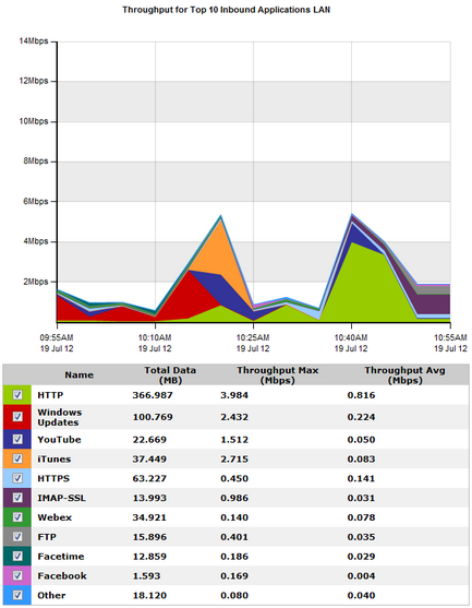
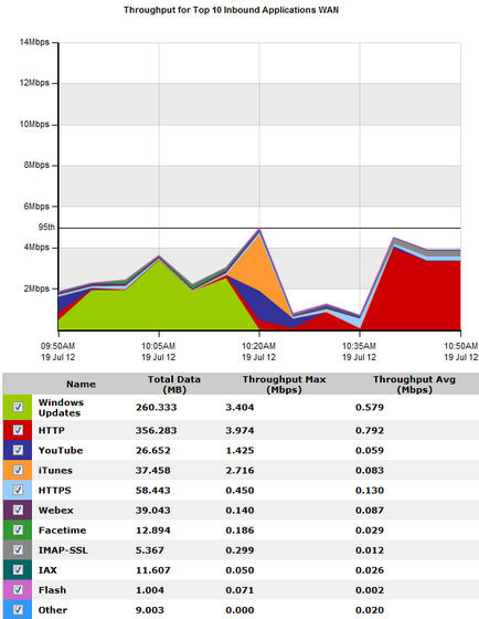
The Network report shows traffic throughput shown over time. You can choose to show applications, application groups, internal or external hosts, internal or external users, conversations, or URLS. You can also choose to remove items from the chart. This report can answer questions such as, “What is the pattern of throughput for particular apps, app groups, users, hosts, etc.? Are there any spikes and what type of traffic may be causing the spikes? What would happen to the throughput if I created a policy to block a particular app, application group, user, or host?” In this way, the network chart can help you to diagnose issues or perform what-if scenarios to determine the right size of your network.
The Network charts aggregates the data not in the top 10 as an "Other" category. The charts show LAN-side and WAN-side charts for both inbound traffic and outbound traffic. The total data volume, maximum throughput, and average throughput is also shown in the tables below each chart.
Go to Monitor > Network.
Remove specific types of traffic from the graph by deselecting their checkbox in the legend below the graph. The remaining traffic models what your network traffic would look like if you blocked that type of traffic. You can then determine an appropriate amount of bandwidth required.
Select the desired percentile level from the Select Percentile Marker to Display selector.
|
|
|