The Optimization Reduction Report shows the amount of traffic reduction achieved due to WAN memory techniques. It also shows the amount of reduction per Exinda appliance peer and per application. These charts can answer questions such as, “Am I achieving the amount of reduction overall that I am expecting? Is a particular application that I am interested in achieving the amount of reduction that I am expecting? ”
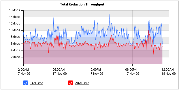
The chart can show the traffic reduction over time as either throughput or percentage reduction. You can also choose the traffic direction to report on - inbound, outbound, or bi-directional.
When reduction statistics are displayed as throughput, there is one time series plotted for LAN throughput and one for WAN throughput.
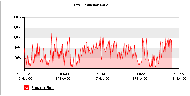
When displayed as percentage reduction, it displays one line graph to represent the reduction ratio, which compares the amount of data transferred after Exinda or to the amount of data transferred before Exinda:
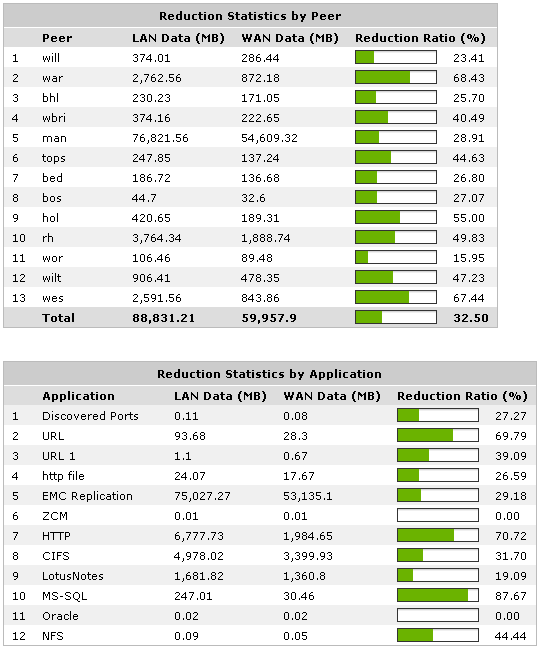
The table below the graphs show reduction statistics broken down by peer, which is a remote Exinda appliance, as well as by Application.
Go to Monitor > Optimization > Reduction.
Reduction Ratio = (Data Transfer Size Before Exinda - Data Transfer Size After Exinda) / Data Transfer Size Before Exinda
To understand how to get a better look at traffic patterns and to remove clutter on the time graph, see Using Interactive Time Graphs.
To understand how to set the desired time range for a chart, see Setting the Time Range.
To understand how to print the report or schedule the report, see Printing and Scheduling Reports.
|
|
|