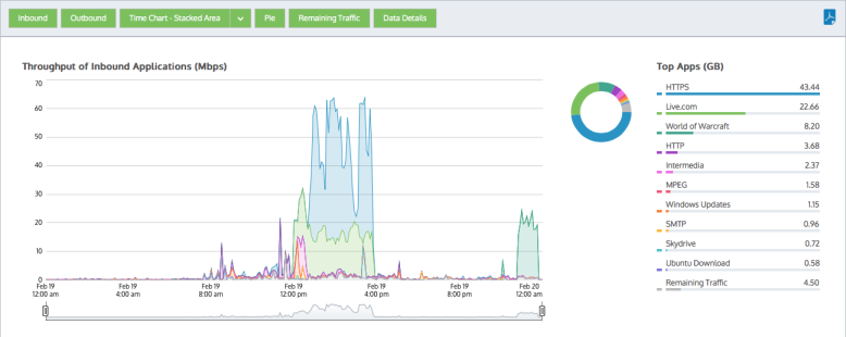
The applications report shows the top applications by volume and their average throughput. Any single application can also be graphed by clicking the filter icon for your desired application in the data table below. Application traffic inbound into your LAN is reported separately from the outbound traffic. You can choose show the entire application traffic by adding in a category to represent the remaining application traffic on your network and so the cumulative stack on the throughput chart represents all the application traffic through the appliance. This will help you understand the significance of the top applications relative to the whole. In additional to showing a stacked cumulative view, you can choose to display the throughput as a line chart with a common zero baseline. You can also choose to show the application volumes as a pie chart. These charts can answer questions such as, “What are the top applications on my network? Are those top applications significant relative to the entire traffic? How much bandwidth does my FTP application typically take? Could one application be choking out the other application traffic? Do any of my top applications appear to be limited?” Using this information you can determine if you need to create policies for these high data volume applications or for the high data volume applications that tend to have large spikes. You may want to create protection policies for your business critical apps and you may want to create limiting policies for high volume non-business critical applications such as recreational applications.
Note: The average bandwidth is calculated as the total bits observed in the charting interval and dividing by the number of seconds in that interval. E.g. For a chart with an hour of data, the intervals are five minutes.
Various components on the screen can be toggled on and off by clicking buttons above the charts.
Note that when generating a pdf report of this screen, the toggle states are taken into account. That is, if you had toggled off the outbound charts, they will not be present in the pdf.
If you drilled into the applications chart from the virtual circuit chart or the subnets chart, then the relevant virtual circuit or subnet will be shown on the filter bar below the button bar. To turn off the filtering, click on the close 'x' in the filter tag.
|
|
Version Info: Filtering to show any single application is available in 7.0.1 and above. |
|---|
|
|
Version Info: Available in 7.0.1 and above. |
|---|
In the data table, each application has a filter icon on the right-hand-side of the row. By clicking on the filter icon, as shown below for Google Encrypted, only the selected application will be charted.
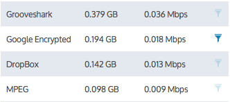
Figure - Click filter icon beside desired application to chart that application.
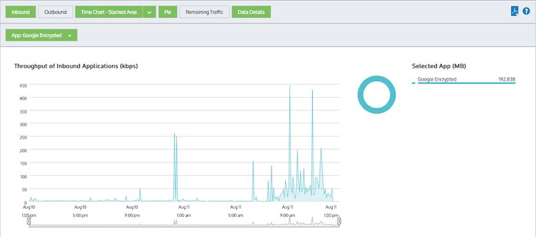
Figure - Applications are filtered to only show 'Google Encrypted'
While in filter mode, any other application filter icon can be clicked to change which application is charted.
To remove this filter and return to the top application set, click the 'x' on the green 'App: Google Encrypted' filter tag.
To understand how to set the desired time range for a chart, see Setting the Time Range.
To understand how to the charts interact and what the toggle buttons do, see Understanding How Charts Relate.
To understand how to drill into the data to find particular filtered data, see Drilling into the Data.
To understand the difference between inbound and outbound traffic, see Understanding Traffic Direction.
To understand how many data points are shown for each time period, see Understanding Traffic Granularity.
To understand how to print the report or schedule the report, see Printing and Scheduling Reports.
|
|
|